
LANDING PAGE
WEBADOO
ABOUT
Webadoo is a landing page for a web development agency that operates across both branding and development. The project started as a Framer site, then rebuilt from the ground up into a fully coded, production-ready landing page with its own design system and component library.
CHALLENGE
The original Framer site lacked a proper design system — colors, spacing, and components were inconsistent and not portable into code. The challenge was to establish a structured visual system in Figma, then reconstruct the entire page in code while elevating the aesthetic direction and maintaining full creative control.
SOLUTION
The process began with Google Stitch AI to generate design mockups and establish the creative direction, informed by 5 years of design experience. From there, the design system was built out in Figma — color tokens, typography scale, and reusable components — before being developed into a fully coded landing page using Vite, React, TailwindCSS v4, and TypeScript.
TOOLS

01
Concept & Branding
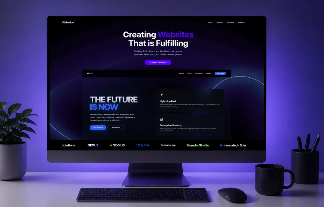
The brand concept is built around the idea of a studio that operates with precision — every design decision deliberate, every development choice justified. The landing page needed to embody that same discipline visually.

02
Aesthetic Direction
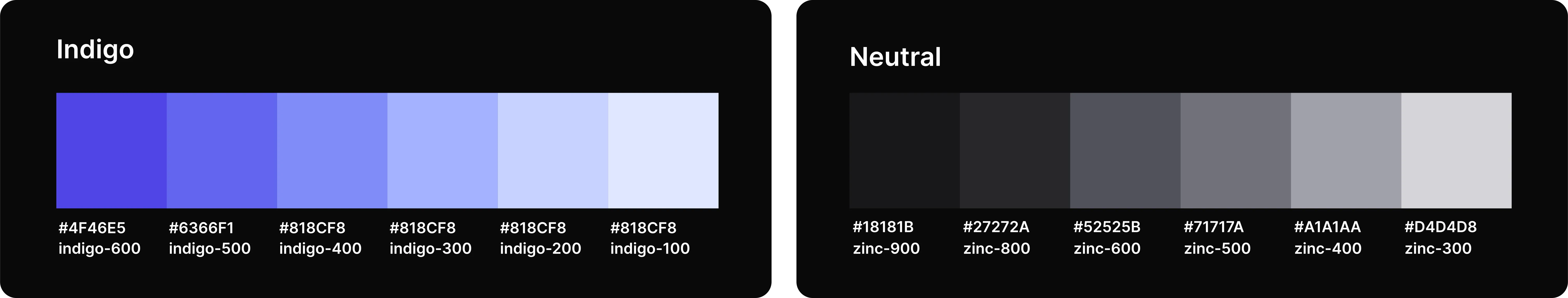
This is complimented by a dark theme throughout the brand. Dark backgrounds allow the indigo accents to command attention without competing for it — creating a visual atmosphere that feels luxurious and intentional rather than loud.
03
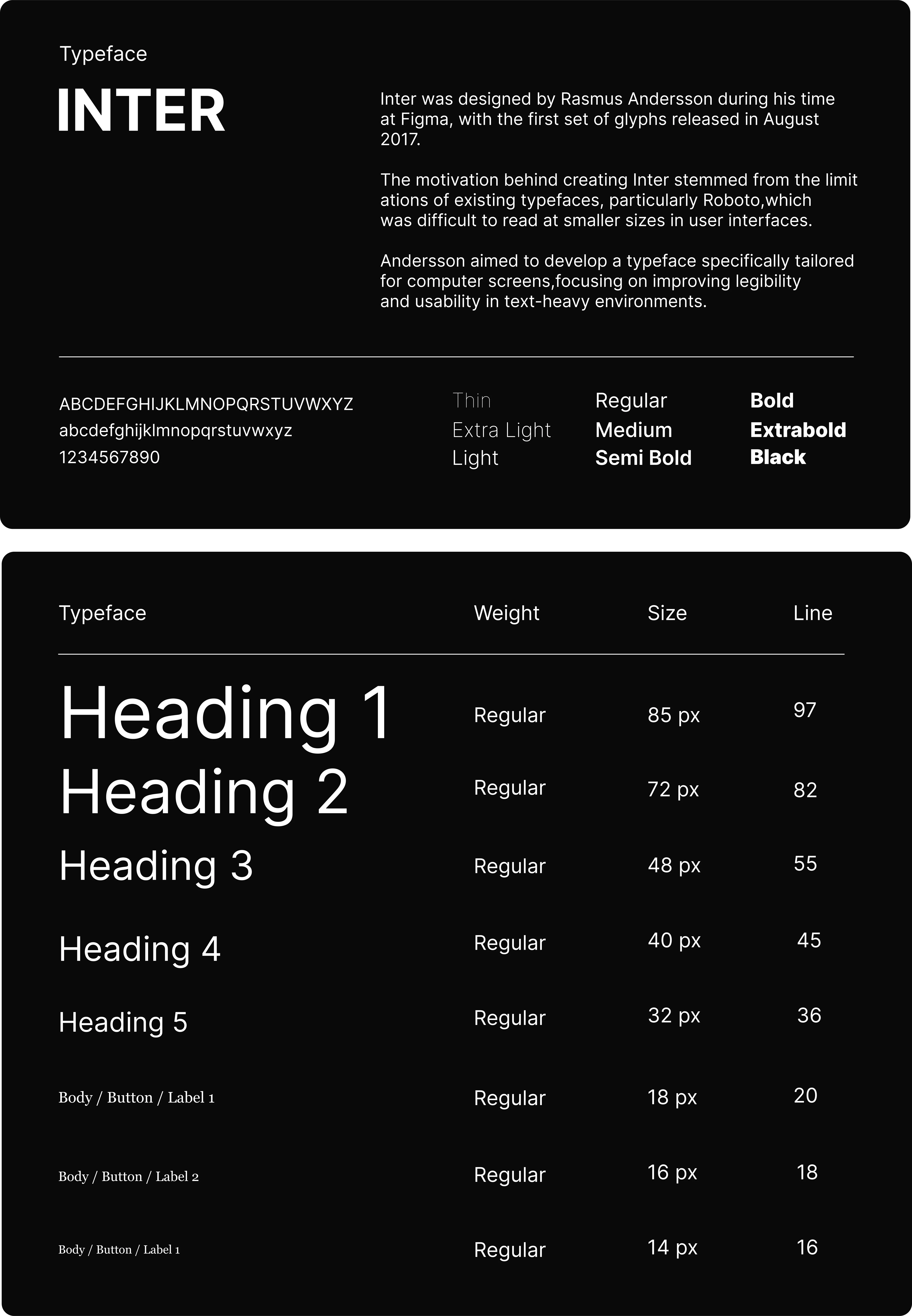
Typography and Typefaces
Its extensive weight range allows the typography system to create a clear hierarchy — heavy weights for headlines that demand attention, lighter weights for body copy that supports without distracting. The result is a reading experience that feels structured and professional throughout.
04
Components
The same component thinking carries into Figma. Each coded component has a Figma counterpart, keeping the design file and codebase structurally aligned. This means updates, variants, and iterations start from a foundation that's already production-ready on both sides.

