LANDING PAGE
SONUS
ABOUT
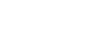
Sonus is a landing page for a software development agency that builds digital products solving real-world problems — from education platforms to ride-sharing apps. The project started as a Framer site, then rebuilt from the ground up into a fully coded, production-ready landing page with its own design system.
CHALLENGE
The original Framer site had no underlying design system — colors, typography, and spacing were inconsistent and not portable. The challenge was to extract what worked visually, establish a proper design system in Figma, and reconstruct the entire page in code without losing the original creative direction.
SOLUTION
The process started in Figma — extracting the existing page using plugins, then rebuilding the design system from scratch: color tokens, typography scale, spacing, and component structure. From there, Figma AI generated the first draft of the codebase, which was then refactored and completed using Opencode for readability, maintainability, and production quality. The result is a fully coded landing page that bridges the gap between design decisions and their implementation.
TOOLS

01
Concept of Sonus
This wasn't a stylistic preference alone. For a software agency positioning itself around impact and ambition, the visual tone needed to match. High contrast, warm accent colors, and confident typography all serve that intent — ensuring the brand never feels passive or muted, no matter where it appears.


02
Logo as a Brand Foundation
Montserrat was chosen as the primary typeface for its geometric clarity and professional range. Its extensive weight variants allow the system to create clear hierarchy — from expressive display headlines down to functional body copy — while maintaining a unified, modern aesthetic throughout.


03
From No-Code to Full Ownership
Vite was chosen over Next.js intentionally. For a landing page with no server-side requirements, Next.js would introduce unnecessary overhead. Vite's fast build times and lightweight output were the right fit for the use case — a decision made based on what the project actually needed, not what was most familiar.
The stack: Vite, React, TailwindCSS v4, TypeScript.
04
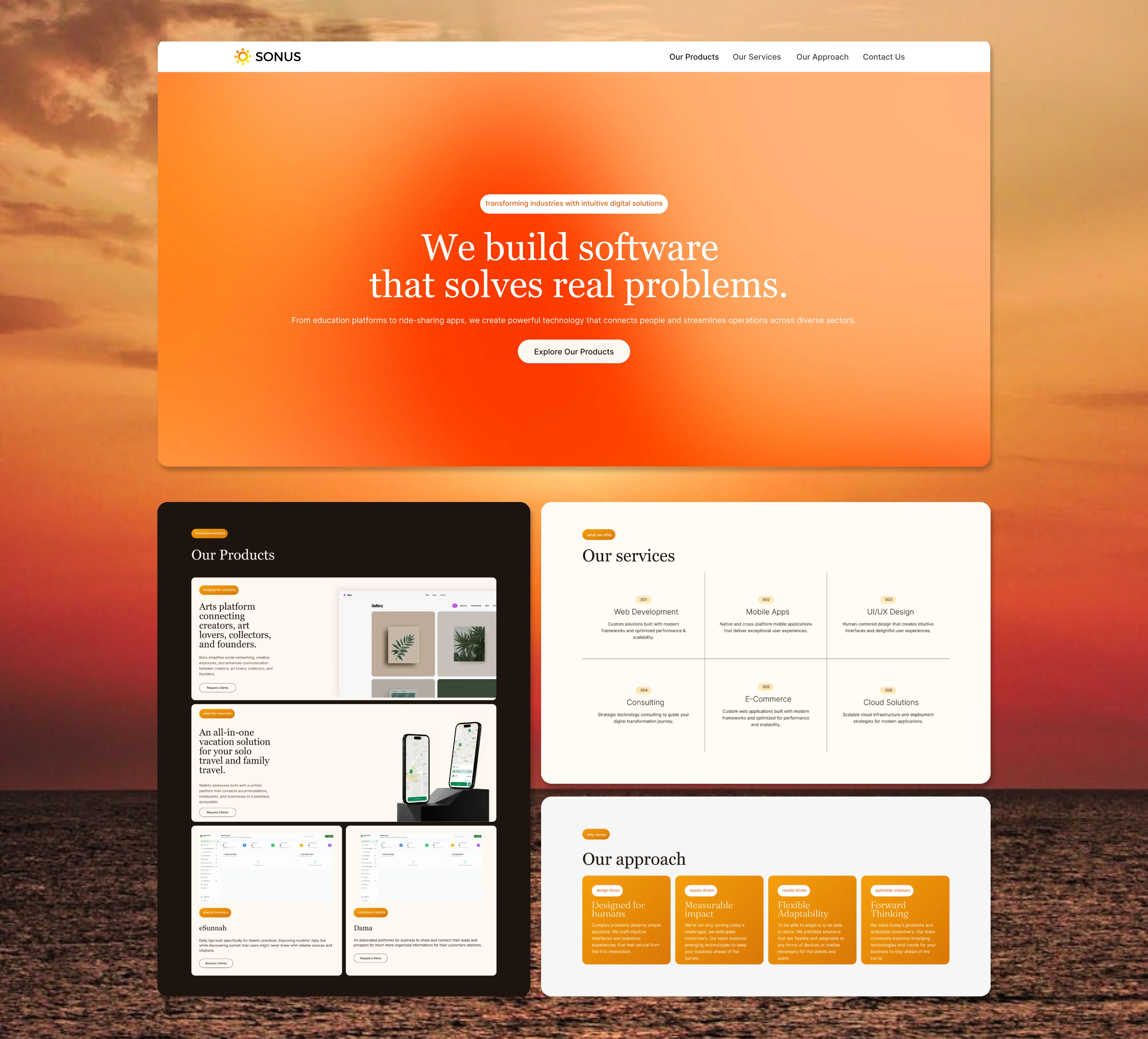
Bridging Colors of Design onto the Development Side of Sonus
HEX codes serve as the source of truth for the visual identity — precise, portable, and usable across any design tool or handoff. The Tailwind equivalents map those decisions directly to utility classes in the implementation, closing the gap between what is designed in Figma and what is shipped in code.
This removes the ambiguity that usually appears during handoff. Developers aren't guessing which shade of amber a component uses — the answer is already in the design file, in the same language the codebase speaks. The visual system stays consistent from Figma to production without manual translation or approximation.
05
Typeface System for Sonus
Headlines carry the heavier weights — particularly in the products section, where the copy needs to communicate unfamiliar products quickly and confidently. The size and weight do the work of drawing the reader in before the details follow.
Body text steps down to a lighter weight, creating a deliberate contrast between what demands attention and what supports it. The result is a reading experience that guides the visitor through the page without friction.


06
Designed to Be Reused
The same component thinking was carried into Figma. Each UI element exists as a Figma component that mirrors its coded counterpart, meaning the design file and the codebase stay structurally aligned. Adding a new section, swapping a variant, or scaling the system into another project starts from a foundation that's already production-ready.
