FULLSTACK DEVELOPMENT
SCARABSHOP
ABOUT
Scarabshop is a fullstack e-Commerce Site where it unifies online vendors into one platform to sell and manage their products.
CHALLENGE
The main challenge in developing Scarabshop is to create a template that is non-technical friendly, yet customizable and scalable in terms of products and sales management for vendors.
SOLUTION
The first approach is to prepare the design and concept of the site while also taking note on the best choice of techstacks that supports both development performance and also creative aspects
TOOLS
01
From User Experience Perspective
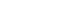
The main goal of the whole site is to make the User Experience less complicated and straightforward.
From a UX perspective,hat comes up on the user's mind is simply "How fast can I get what I want?" "How easy is it to get what I want?" and "Is it worth my time to use it?". And thus, the whole site is designed for that sole purpose of less time-consumed of conversation process.
From a UX perspective,hat comes up on the user's mind is simply "How fast can I get what I want?" "How easy is it to get what I want?" and "Is it worth my time to use it?". And thus, the whole site is designed for that sole purpose of less time-consumed of conversation process.

02
Scarabshop's Mood and Brand Concept
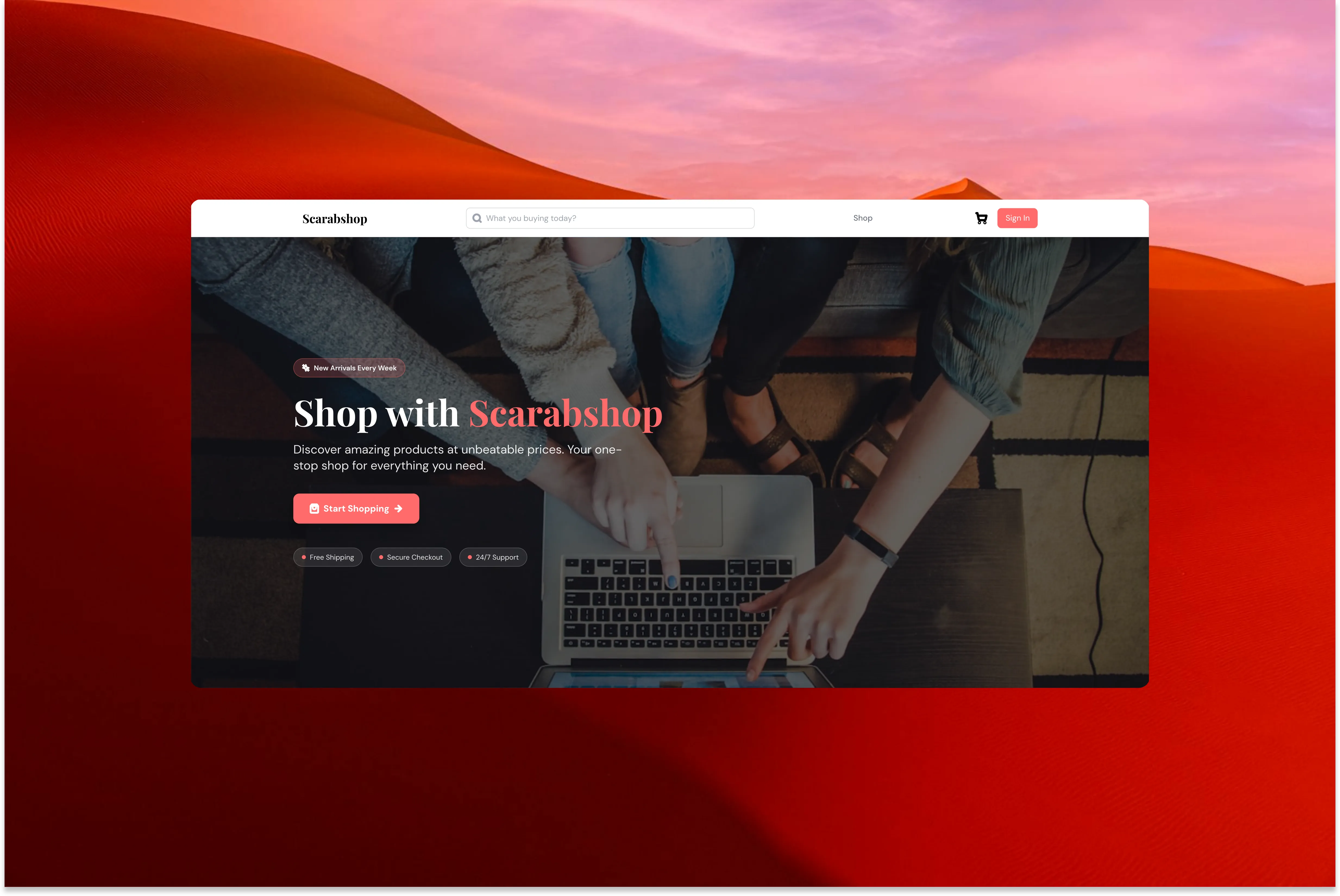
By taking account of how Ancient Egypt presents scarab as a symbol of Wealth and Eternity, we took that as a concept for Scarabshop branding, where vendors sells products regardless of the type of goods.
The choice of the colors influenced by the intention to invoke warm and stimulation towards the process of purchasing.
From creative and technical perspective, the colors were chosen directly from the Tailwind Classes to close the gap between creative and technical executions.
The choice of the colors influenced by the intention to invoke warm and stimulation towards the process of purchasing.
From creative and technical perspective, the colors were chosen directly from the Tailwind Classes to close the gap between creative and technical executions.

03
Typefaces Choices
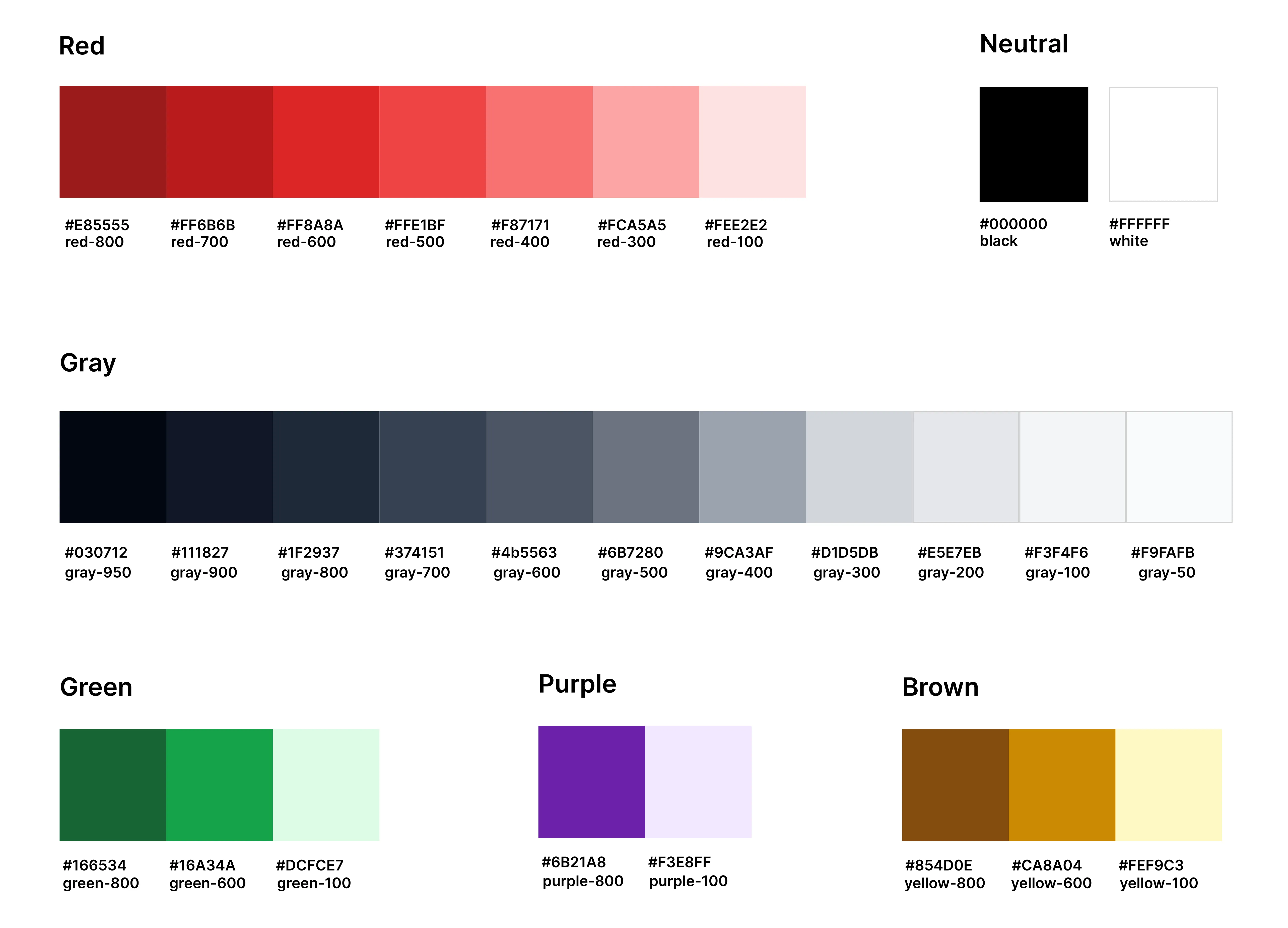
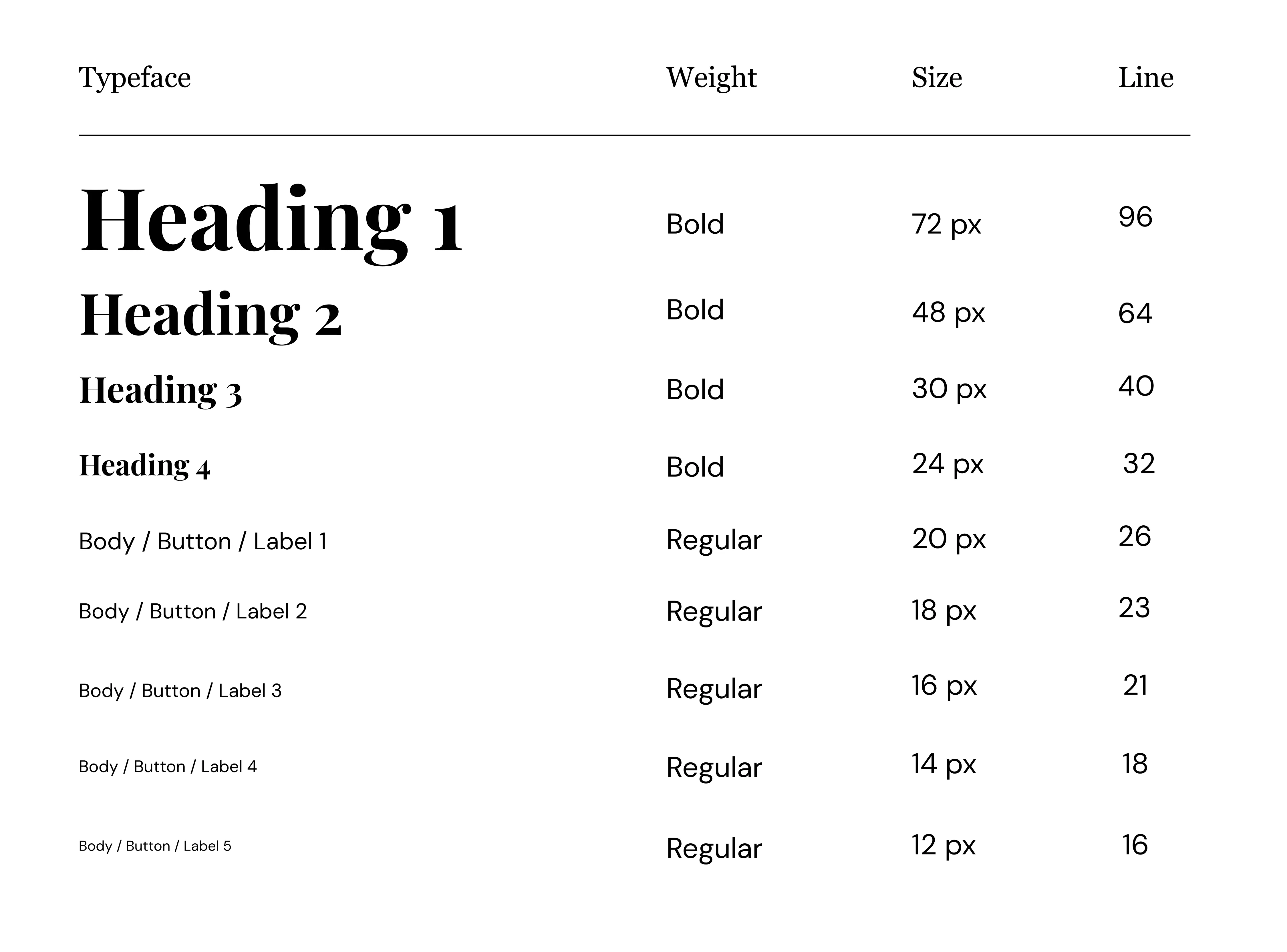
The serif font; Playfair Display, is chosen for the purpose of giving a sense of premium and elegance in every title displayed.
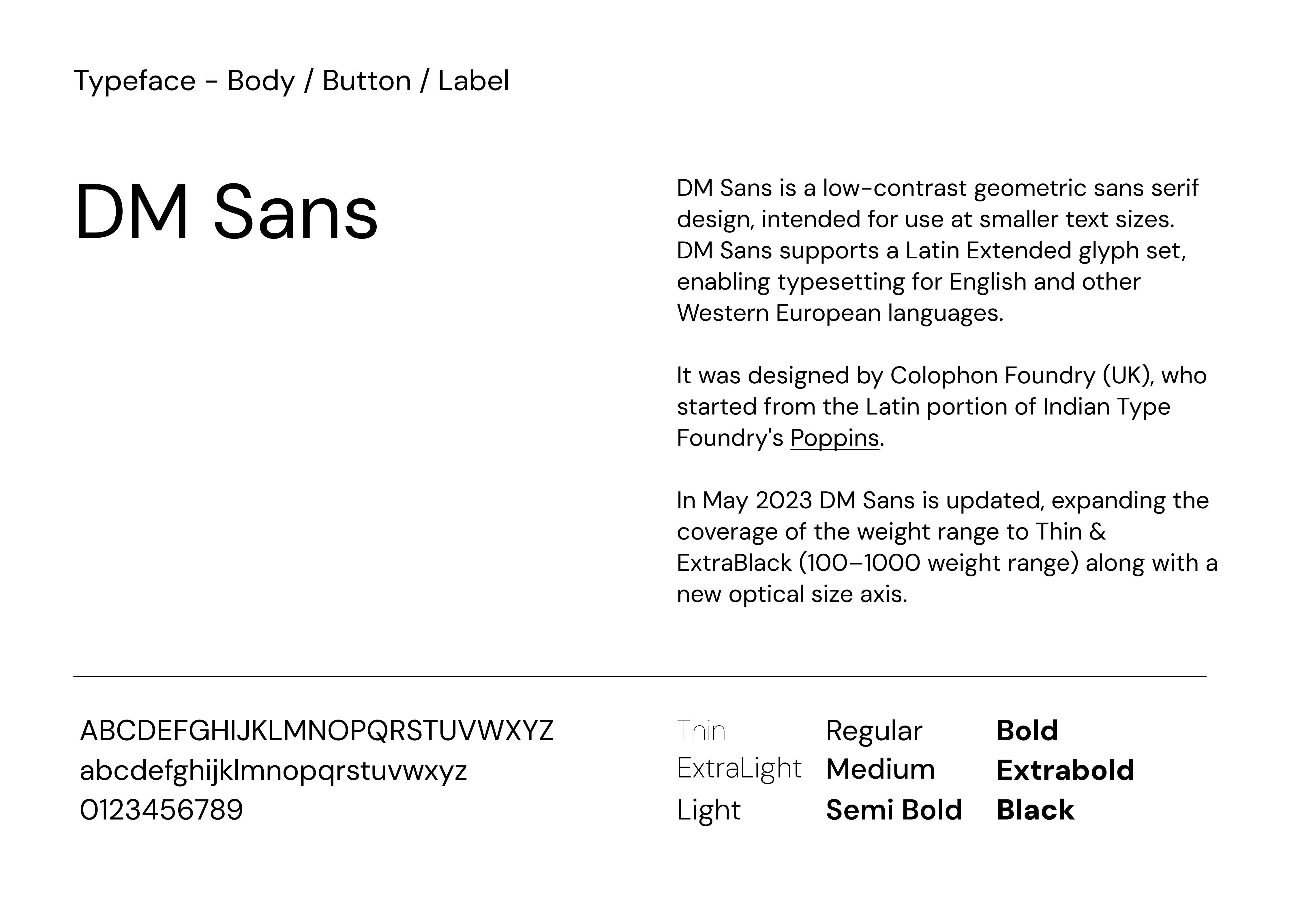
While for the body text, DM Sans is chosen for the purpose of legible and comfortable reading experience.
A system for the typefaces were made to unionized the system for both designers and developers to maximize the efficiency of design and development process.
While for the body text, DM Sans is chosen for the purpose of legible and comfortable reading experience.
A system for the typefaces were made to unionized the system for both designers and developers to maximize the efficiency of design and development process.
04
Components Library
A system for the components were made to ensure the consistency of the design, visual and codes. The components were made to adapt to Desktop, Tablet and Mobile, with their own respective breakpoints.
The library also includes icons and buttons as an aesthetic components to the project as a whole.
The library also includes icons and buttons as an aesthetic components to the project as a whole.
