LANDING PAGE
BRANDO STUDIO
ABOUT
Brando Studio is a creative studio that bridges creativity and strategy — offering branding, advertising, and development services to help brands establish a meaningful online presence. The landing page was designed and built from scratch, without a Framer origin, making every decision deliberate from the first pixel.
CHALLENGE
The challenge was to build a landing page that felt genuinely creative without sacrificing clarity. Brando Studio's positioning required the page to feel elegant, sophisticated, and modern — while still communicating services and value propositions in a way that converts visitors into potential clients.
SOLUTION
The process started with Google Stitch AI to generate the initial design direction and mockups, informed by years of creative experience. From there, the design system was established in Figma before being developed into a fully coded landing page using Vite, React, TailwindCSS v4, and TypeScript. The hero section uses Three.js to render an interactive 3D terrain — a deliberate creative choice that sets the tone before a single word is read.
TOOLS

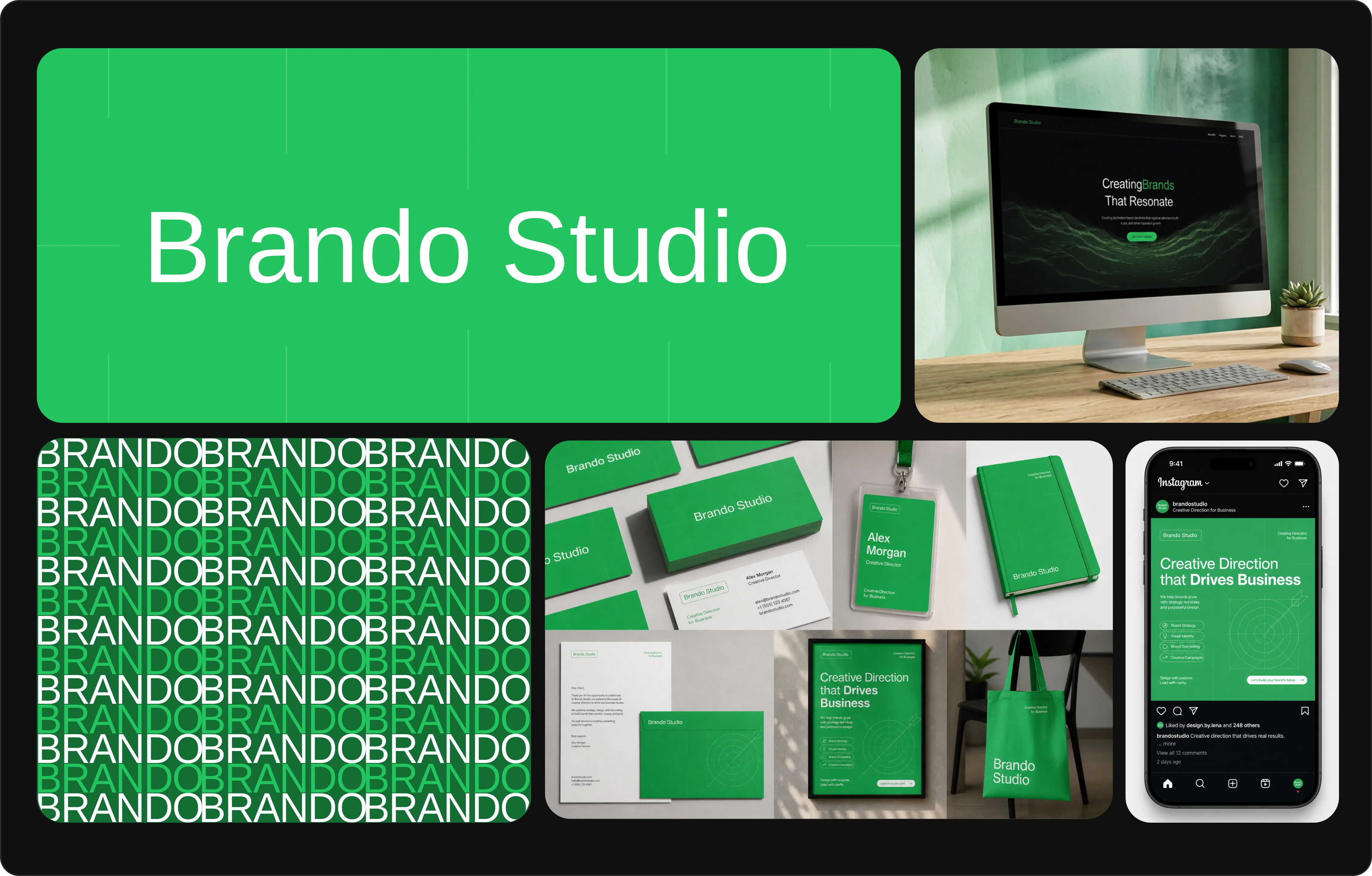
01
Landing Page
The layout moves deliberately: a hero that commands attention, a value proposition section that builds the case, featured projects that prove it, and an FAQ that removes friction before the conversation starts. Every section earns its place.

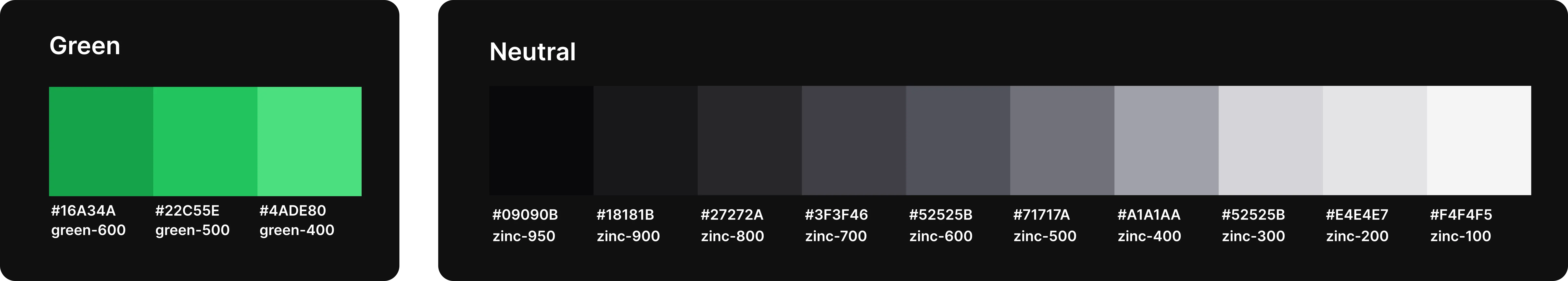
02
Aesthetic Direction
The green is deployed against a deep dark background throughout, which prevents it from reading as organic or casual. Instead it reads as precise and energetic — a studio that takes creativity seriously. The contrast between the dark base and the vivid green accent creates a visual tension that keeps the page feeling alive.
03
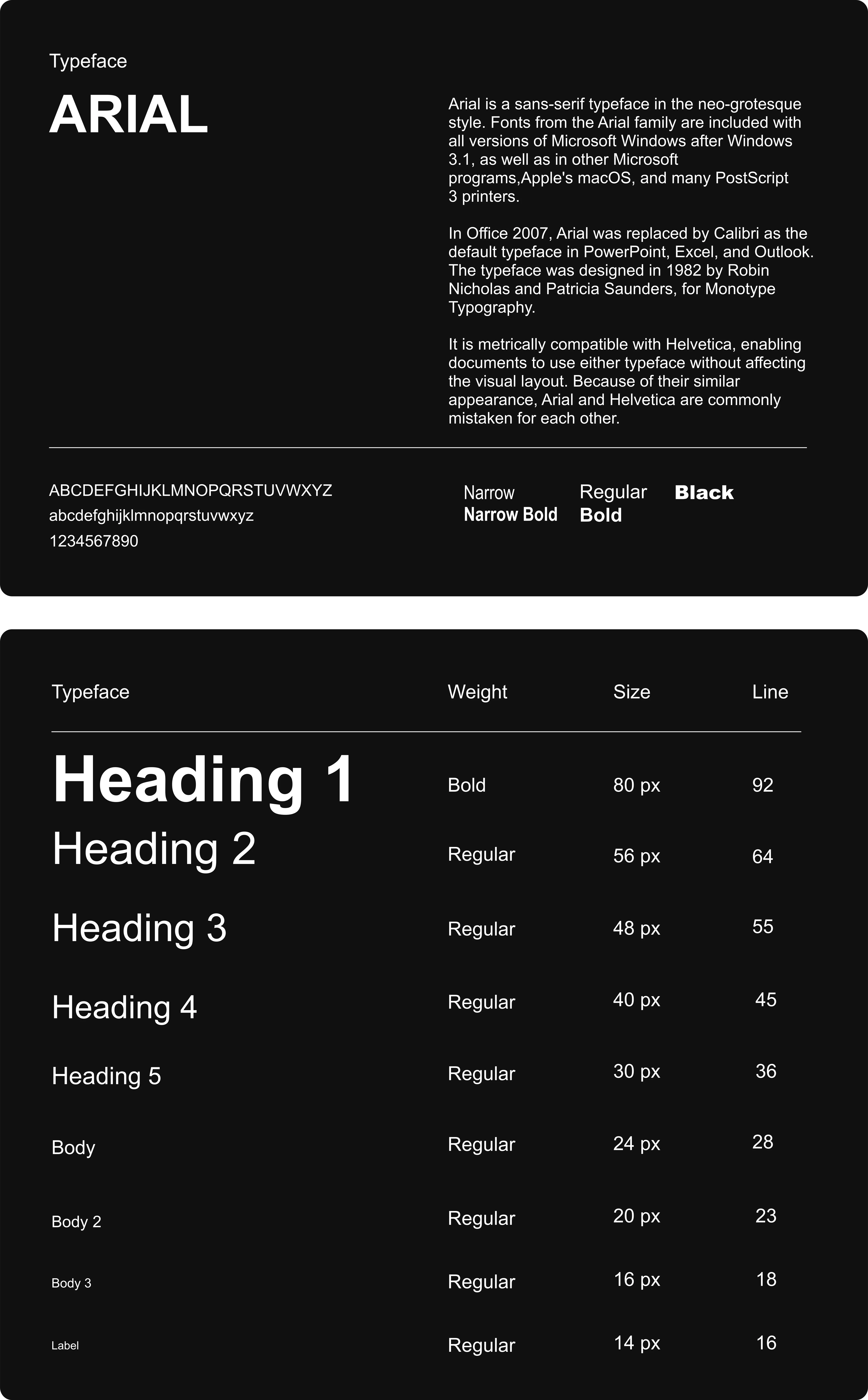
Typefaces with Sentimental Values
Using Arial is a deliberate act of reclamation. It says: we started where everyone starts, and we built something from there. For a creative studio, that's a meaningful origin story to wear as part of the identity — familiarity reframed as confidence.
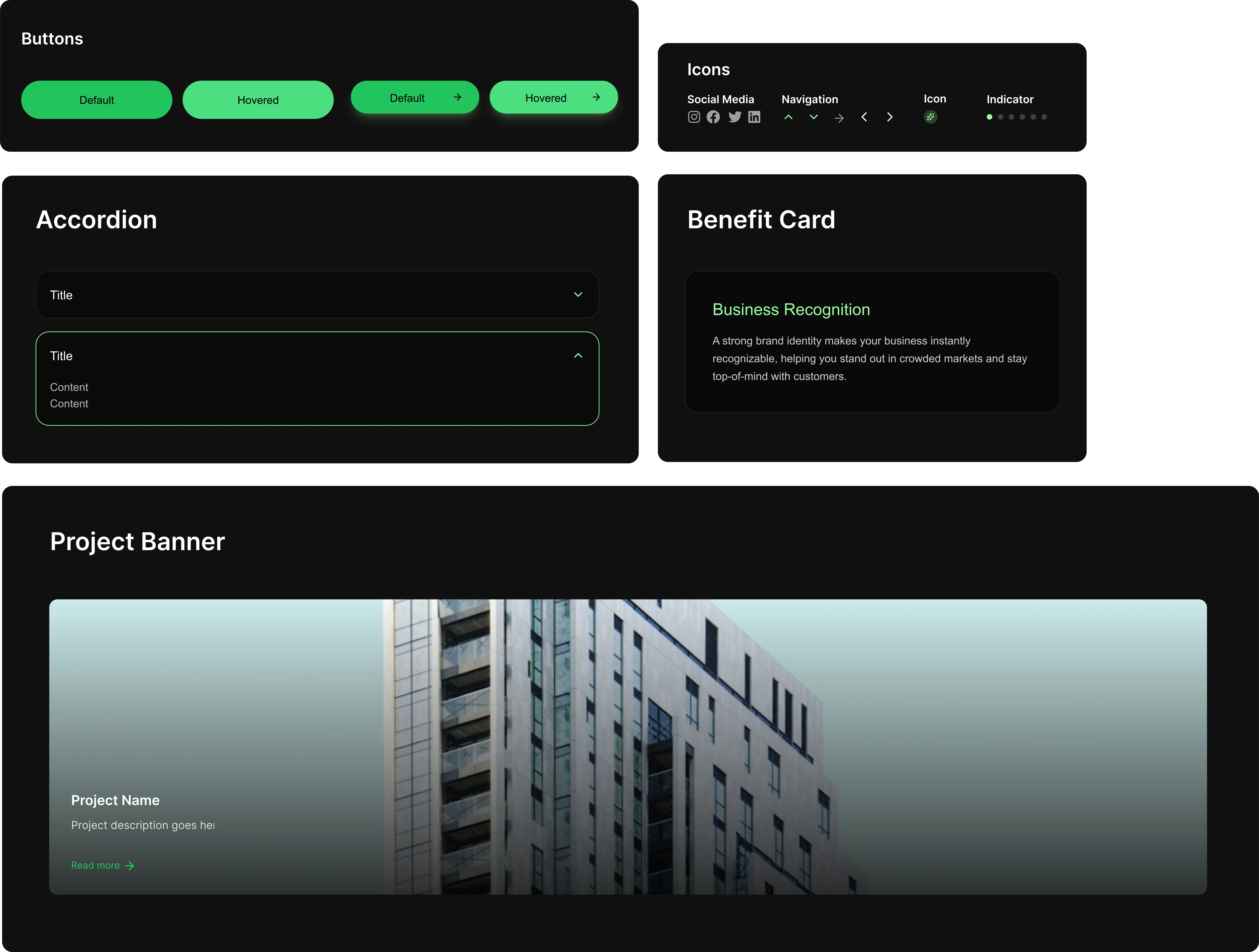
04
Components
Each UI pattern is isolated enough to be extracted and dropped into a different project without modification. The same components exist as Figma counterparts, keeping the design file and codebase aligned so that iterations on either side don't create drift between what's designed and what's shipped.